


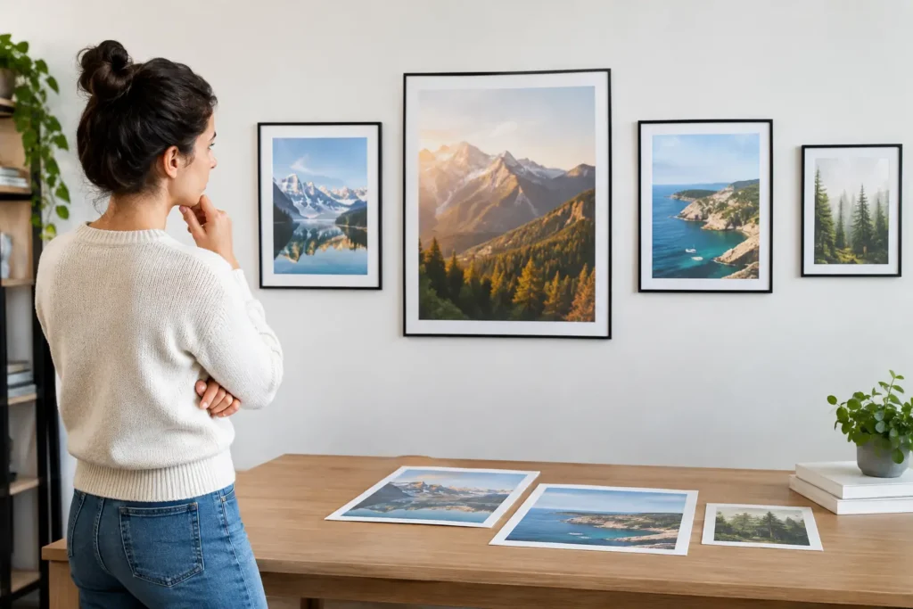
How to Choose Poster Sizes for Better Results
A poster that is too small gets missed. A poster that is too large for its location can feel crowded, cost more than necessary, and create installation headaches. Knowing how to choose poster sizes before the design is finalized helps you spend wisely and gives your message the visibility it deserves.
For a San Diego event, a retail promotion, an art release, or an internal business campaign, the right size comes down to where people will see it, how far away they will be, and how much information they need to absorb. Start there, then let your design and budget guide the final choice.
Start With Viewing Distance
The first question is not, “What poster size looks best?” It is, “How far away will people be when they first see it?”
A poster viewed from a few feet away, such as one in a café, office hallway, community board, or trade show booth, can often work well at 11 x 17 inches. At that distance, viewers can read details such as dates, locations, pricing, QR codes, and sponsor information.
If the poster needs to catch attention across a lobby, storefront window, busy corridor, or outdoor sidewalk area, move up to 18 x 24 or 24 x 36 inches. Larger posters give your headline and key visual enough presence to compete with the surrounding environment.
Think about the viewer’s journey. A passerby may first notice your poster from 20 feet away, then walk closer to read it. Your event name, offer, or call to action should register from a distance. The smaller details can do their job once someone stops.
How to Choose Poster Sizes by Location
The display location usually narrows the decision quickly. Measure the available area before designing, including any frame, window, easel, sign holder, or wall space. A poster can be visually strong on screen and still look undersized once it is placed in a large open room.
Countertops, doors, and community boards
For close-range promotions, 8.5 x 11 and 11 x 17 are practical choices. They are easy to distribute, affordable to print in quantity, and familiar to venues that allow public notices. An 11 x 17 poster offers noticeably more room for an image and event information without becoming difficult to hang.
These sizes work well for restaurant specials, local workshops, school announcements, fundraiser promotions, and in-store notices. Keep the layout focused. A small poster cannot carry a long paragraph and still be readable at a glance.
Retail windows and indoor walls
An 18 x 24 poster is one of the most flexible options for business promotions. It has enough visual weight for retail windows, salons, gyms, offices, galleries, and event venues while remaining easy to frame, mount, and transport.
Choose this size when your audience will be walking by at a moderate distance and you need a clear headline plus supporting details. It is also a strong format for artist prints and limited-run promotional pieces because it feels substantial without requiring a large wall.
Events, high-traffic spaces, and street-facing displays
A 24 x 36 poster is a go-to format for events that need visibility. It is large enough for venue entrances, public posting areas, campus promotions, convention spaces, and storefront displays. For concerts, grand openings, fundraisers, and seasonal campaigns, this size gives the creative room to work.
For larger spaces or outdoor-facing displays, 27 x 40 and 36 x 48 may be the better fit. These formats need disciplined design. More space does not mean more copy. It means larger type, cleaner visual hierarchy, and a message that can be understood quickly.
Let the Message Set the Minimum Size
Poster size and content have to work together. A poster announcing a one-day sale can be large, simple, and bold: a strong image, the offer, the deadline, and where to go. A conference poster may need the event title, speakers, date, venue, registration details, and partner logos. That additional information requires either a larger format or a more selective edit.
Ask what a person must know in five seconds. Usually, it is your brand, the main message, and the next action. Everything else should support that priority.
If you need to include a QR code, make sure it is large enough to scan in real conditions. A code that works from a computer screen may fail on a glossy poster behind glass or in low light. Place it where people can approach it comfortably, and avoid squeezing it into a bottom corner alongside several other details.
Pick Orientation Based on the Design, Not Habit
Portrait posters are familiar because they follow the shape of a page. They are a natural choice for event announcements, menus, informational notices, and artwork with vertical subjects. They also fit many standard poster frames and display stands.
Landscape posters can be more effective for wide storefront windows, directional signage, panoramic photography, and promotions with a short message. A horizontal layout may stand out precisely because many competing posters are vertical.
Square posters are useful for social-first campaigns, product launches, and art-driven promotions. They can feel modern and intentional, but they are less likely to fit standard frames. If framing or distribution is part of the plan, factor that into the cost before committing to a square format.
Design for Readability at the Finished Size
A common production issue is approving a design at 100 percent on a laptop without considering its real-world size. The final poster needs clear hierarchy, not simply attractive graphics.
Your headline should be the largest element. It should communicate the main idea without requiring viewers to read every line. Secondary information, such as the date and location, should be easy to find next. Fine print, sponsor logos, terms, and web details belong last.
Use contrast generously. Light gray text on a white background may look subtle on screen but disappear under venue lighting. A busy photo can also make type hard to read. Add a solid color area, a transparent overlay, or more open space behind text when needed.
For print quality, build files at the final size with high-resolution images. A small image stretched to fit a 24 x 36 poster will not become sharper just because it fills the layout. For full-bleed artwork, include bleed around the edges so the color or image reaches the trim line cleanly. A local print team can review a file before production and flag issues that might affect the finished piece.
Balance Impact With Budget and Quantity
Larger posters use more material, require larger-format printing, and can cost more to ship or install. That does not mean smaller is always the economical choice. A poster that no one notices is not a bargain.
Consider the campaign as a whole. If you need 200 posters for neighborhood distribution, 11 x 17 may deliver the best reach for the budget. If you need four posters at a key event entrance, investing in 24 x 36 or larger may create far more impact.
Paper choice matters too. Glossy stock can make photography and color pop, while matte stock is easier to read under bright lights and creates a refined feel. For temporary outdoor use, weather-resistant materials may be worth the added cost. For a gallery print or retail display, heavier stock can reinforce the quality of the work.
Plan the Poster and Its Display Together
Before placing an order, confirm how each poster will be displayed. Will it go into a standard frame? Be mounted to foam board? Taped inside a window? Placed on an easel? Rolled and carried to multiple locations?
Those details can change the ideal size, stock, and finish. A thin paper poster may be perfect for a short-term community campaign but curl in a freestanding sign holder. A large poster may need mounting or a rigid backing to stay presentable throughout a multi-day event.
It also helps to order a small proof or test print when color accuracy is critical, especially for artwork, brand colors, product photography, and skin tones. Seeing the piece in person gives you a better answer than any screen preview.
The best poster size is the one that fits the space, reaches the viewer, and makes the next step obvious. If you are choosing between two options, bring the display location, intended quantity, and design file into the conversation. At Ego id Media, a quick production review can help turn a good-looking poster into one that performs where it is posted.
Leave a reply

Leave a reply