


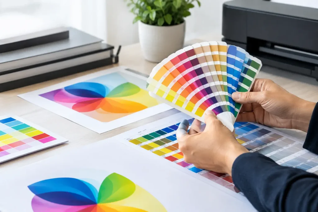
Brand Color Matching for Print That Stays True
A navy blue that looks sharp on your website can turn purple on a flyer. A bright green logo can print duller than expected on a recycled uncoated card. These are not small details when your business is trying to look established, recognizable, and professional. Brand color matching is the process of making sure your colors stay as consistent as possible across business cards, signs, brochures, apparel, packaging, event materials, and every other place customers see your name.
For San Diego businesses, organizations, artists, and event teams, the goal is not simply to pick a color that looks close. The goal is to create a color system that holds up across real-world materials, production methods, and lighting conditions. Here is how to make better color decisions before your next print run.
Why Brand Color Matching Is a Print Priority
Color is one of the fastest ways people recognize a brand. Before someone reads a headline or scans a QR code, they register the palette. When your postcard, trade show banner, presentation folder, and staff shirts use visibly different versions of the same color, the result can feel disconnected – even when the design itself is strong.
Consistency also protects the work you have already invested in. If your logo was designed around a particular blue, orange, or forest green, that color carries meaning. Changing it accidentally from one product to the next weakens the visual memory you are building with customers.
Perfect matching is not always possible, and a good print partner will be honest about that. Ink, fabric, vinyl, paper texture, finishing, and lighting all influence how color appears. The practical target is controlled consistency: choosing the right color specifications, materials, and proofing process so variations are expected, minimal, and appropriate for the item.
Start With a Clear Color Standard
A brand should not rely on screenshots, verbal descriptions, or a logo pulled from an old email attachment. Those references can be useful, but they are not production standards. The strongest starting point is a simple brand color guide that identifies the approved values for each core color.
Know Which Color Code Applies
Different color systems serve different jobs. RGB is used for screens, including websites, social media, presentations, and digital ads. It creates color with light, which is why it can display vivid blues, greens, and neon-like shades that standard printing cannot always reproduce.
CMYK is the four-color process used for most full-color print products. It builds color from cyan, magenta, yellow, and black inks. A CMYK file is usually the right direction for flyers, catalogs, postcards, brochures, and many other commercial print projects, but it should be prepared with realistic print expectations.
Pantone, often called a spot color system, is especially useful when a precise brand color matters across repeat orders. Rather than building a color from four process inks, a spot color uses a specifically mixed ink. It can improve consistency for logo-heavy materials, limited-color designs, and specialty applications. It may also add cost or require different production planning, so it is not automatically the best choice for every job.
Hex codes are for digital use. They are useful in your brand guide, but a hex value alone does not tell a printer exactly how your color should reproduce on paper, fabric, or signage.
For most small businesses, a usable brand guide includes a primary CMYK build, RGB values, hex codes, and Pantone references for the colors that truly define the brand. If you are unsure what already exists, bring in your logo files and current materials before ordering. A short conversation early can prevent an expensive correction later.
Do Not Convert Colors at the Last Minute
Designing in RGB and converting to CMYK just before sending a file can produce a surprise. Bright aqua, electric blue, vivid green, and deep purple are common trouble spots because they may sit outside the printable CMYK range. The conversion can make those colors less saturated or shift their hue.
That does not mean you should avoid bold color. It means you should build and review the artwork for its intended output. If a brochure is primarily a print piece, designing with a CMYK-aware workflow gives you a more dependable preview. If the same campaign will run online and in print, set expectations that the screen version and printed version will be closely related, not identical twins.
Paper Changes the Way Your Brand Colors Look
Paper is not a neutral background. Its brightness, coating, weight, and texture all affect ink absorption and perceived color.
Coated paper tends to deliver sharper detail and richer-looking color. It is a strong choice for product catalogs, photo-driven postcards, polished sales sheets, and high-impact event collateral. Gloss coating can make color feel lively, while matte or silk finishes offer a more restrained, premium look with less glare.
Uncoated paper has a natural, tactile quality that works well for letterhead, note cards, menus, and brands that want a more organic feel. Because ink absorbs differently, colors may appear softer or less saturated than they would on a glossy stock. That is not a flaw. It is a material decision that should be part of the design conversation.
Textured, recycled, colored, kraft, and specialty papers add another layer of personality, but they also make precise color reproduction more challenging. A white logo printed on kraft stock will not behave the same way as that logo on bright white coated paper. When brand accuracy is critical, ask to see samples or request a proof on the actual stock whenever possible.
Treat Every Print Method as Its Own Surface
A color that looks right on a business card may require adjustment for a banner, sticker, T-shirt, or mug. Large-format printing, screen printing, digital garment printing, embroidery, and promotional product decoration all use different materials and processes.
For example, fabric color becomes part of the equation when printing apparel. White ink on a black shirt often needs an underbase, and the fabric itself can change how the final color reads. Embroidery uses thread colors rather than ink, which means a close thread match may be better than chasing an impossible exact match.
Signs and banners need to perform outdoors or under harsh venue lighting. Fine art prints may prioritize subtle tonal range and paper character. Branded pens, drinkware, and tote bags may have limited imprint areas or available color options. Good brand color matching means adapting the palette thoughtfully without losing the brand’s recognizable character.
Proof the Colors That Matter Most
A digital proof confirms layout, spelling, image placement, and general color direction. It is valuable, but your monitor settings, screen brightness, and surrounding light can affect what you see. Do not treat a PDF viewed on a laptop as a final color authority.
A hard proof or press proof gives you a more meaningful chance to evaluate printed color. It is particularly worthwhile for a large order, a new brand launch, a color-sensitive product catalog, or a project with a signature color that appears across the entire piece.
When reviewing a proof, look at it under neutral lighting. Compare it to an approved printed sample, not just a screen. Ask practical questions: Does the logo still feel like our logo? Does the contrast support readability? Does the color work with the selected paper? Is the difference noticeable to a customer, or only visible under intense side-by-side inspection?
That last question matters. Chasing a microscopic difference can add cost and delay without improving the customer experience. On the other hand, ignoring an obvious mismatch can create a stack of materials you do not feel confident handing out.
Build a Repeatable Process for Reorders
The first project is where color standards are set. Reorders are where those standards prove their value. Keep final approved files in one place, clearly labeled with the product, size, paper stock, finish, and color requirements. Save photos or physical samples of approved pieces, especially if your brand uses a distinctive spot color.
Before a reorder, confirm whether anything has changed: the paper stock, print method, artwork version, finish, or quantity. Even a reasonable substitution can change color appearance. A quick review is far easier than discovering differences after production.
At Ego id Media, we help clients move from artwork questions to finished materials with one local team. That means discussing color before a job is on press, matching the product to its purpose, and making sure the final piece supports the brand you are trying to build.
A Simple Pre-Print Color Check
Before approving your next job, make sure you can answer these questions:
- Are you using the correct logo file and approved color values?
- Is the artwork prepared for the intended print method, not just for screen viewing?
- Have you selected a paper, fabric, or product surface that supports the desired look?
- Does the project need a Pantone spot color, a printed proof, or both?
- Will this item be compared with existing materials that need to match closely?
The best printed marketing does more than carry your logo. It makes every customer touchpoint feel like it came from the same confident business. Bring your color references, your ideas, and the piece you need to produce, then make the color decisions before the presses start rolling.
Leave a reply

Leave a reply